Showing posts with label Comics. Show all posts

Saturday, October 27, 2018

Four-Color Fashion: Batman


Superheroes live and die by their visual designs. A silhouette, a stance, a color combination, a great hero design stands the test of time and evolves into a form best suited for the character. Sometimes the creators knock it out of the park on the first try, other times it takes several iterations to get to something iconic, but regardless, a top tier superhero design is visually distinct and unmistakable.

The whole point of this little exercise is to take a quick walk through comic book history by way of visual design to see what works and what doesn't for characters that I feel are important or that I just plain like for some reason. (So if I do a big post on Firestorm: the Nuclear Man, then you know why). I doubt this will be some regular thing, but I love comics and hate to see the garbage fire that is the modern industry, so this is a fun reminder of the better days. I'm going to limit it to actual comic costumes because it would get extremely bloated with various movie, tv and game suits, and also because the roots go deeper than some actor who thinks he's bigger than the mask.


The best place to start? Bruce Wayne, because there's been surprisingly little deviation from the basic design.


First appearing in Detective Comics #27 in 1939, you know the deal with Batman. Rich kid, murdered parents, devotes his life to philanthropy and also dressing up as a bat to fight crime more directly. Uses detective skills and gadgets to win the day. Initially a ripoff of the Shadow and the Phantom, but evolved into his own thing. The original Bat-Man was put together by artist Bob Kane and writer Bill Finger, and the first version put to paper was an edgier vigilante who used a gun to fight crime, and his design reflected that. Criminals being a cowardly and superstitious lot, Wayne adopted a bat motif, because they fly stealthily at night and tend to scare the bejeezus out of people when they startle them.


The costume reflects that. Gray bodysuit, black cape that kind of looks like wings, a deeply pointed cowl with narrow eyes. Dark blue/black trunks and boots broke up the grayscale, and a yellow utility belt drew the reader's attention to his gadget usage. The palette is set: Gray, black, blue, gold. And then there's the purple gloves. No idea why.


As the Golden Age wore on, Batman's image softened. He ditched the guns and adopted a no-killing rule, he picked up a sidekick in Robin, and he moved to more of weightlifter body type. The bat ears got shorter, the cowl became less severe, and the lantern jaw made it clear that this was a hero. The cape switched from black to dark blue and the purple gloves were mercifully replaced with the iconic “serrated” gloves. This became the template for Batman, where every following variation would build off of.


Here's where it gets complicated because DC Comics loves retcons and reboots. The Golden Age Batman would later become known as “Earth-Two Batman,” occupying a separate continuity from the “Earth-One Batman” of the Silver Age, where he would retroactively “first appear” in Superman #76 in 1952 (an issue written by pulp novelist Edmund Hamilton, the husband of the mighty Leigh Brackett, Queen of Space Opera). Initially appearing much as the 40s version, and following along with the lighthearted camp of the 50s and 60s, this Batman would get a single major costume change in Batman #164 by penciller Sheldon Moldoff: the gold badge around the bat logo. This was the Batman design of Adam West, and as the 60s moved on, the stories in the comics grew less goofy and touched on more serious themes again.


Probably the biggest influence on the Batman design of this era was Neal Adams, who started as a cover artist on Batman in the late 60s and started doing interior pencils in 1971. Adams brought a kinetic dynamism to Batman (and his cape), and made him leaner, slightly meaner, and gave him new threats to deal with, like Ra's al Ghul. Aside from the lengthening of Bats' ears, the costume remained fundamentally the same, the real change was the increase in dynamic lighting and use of shadows to create mood. Gothic horror, film noir, and martial arts elements permeated the Bronze Age Batman titles of the 70s and 80s, and the design could go from the moody streets of Gotham City to hanging out with the Justice League and the Outsiders.


Technically, “Earth-One Batman” stopped existing after Crisis on Infinite Earths in 1986, and he was folded into the “New Earth Batman” of the new, unified continuity. This was Batman at his most balanced, the Caped Crusader AND the Dark Knight Detective. A Batman who would take the time to help some kids out, mentor the junior members of the Justice League, and later suffer some of his greatest personal losses like the death of Jason Todd and having his back broken in Knightfall. This was the design adapted for the first couple seasons of Batman: The Animated Series.


In the 90s, the design moved all over the place. Different artists went in different directions; sometimes the cowl and trim are blue, sometimes black. sometimes the ears got shorter, sometimes they got insanely tall with Sam Keith on art duty (but that was a deliberately extreme visual choice).


Frank Miller's seminal The Dark Knight Returns from 1986 heavily influenced the artists of the 90s, since a grizzled, chunky Batman with dark, muted colors and no cheerful gold badge suited the edgy grit of the 1990s. The thing is, TDKR is an alternate 80s series deliberately stylized to portray an over-the-hill Bruce Wayne operating in a dystopian hellscape where everything's gone wrong. He wasn't meant to be what a “Batman in his prime” looks like. 


That would be more along the lines of Batman: Year One, written by Miller himself and drawn by David Mazzucchelli in 1987.


In 2002, Batman's design seemed to stabilize with Jim Lee's rock-solid design during the Hush storyline: Gray bodysuit, dark blue cowl, fairly short ears, large black bat symbol on the chest, muscular past the point of ordinary people but not a brick wall, and more often than not, a permanent scowl. The Batman of the 00s was serious business. It was all grit and very little of the warmth that balanced out his humanity (and his sanity). Batman's cold “Batgod” personality where he was paranoid to the point of constantly being prepared to take down anybody, be it friend or foe became a cliché. It became a plot point in Infinite Crisis where his paranoid dickishness led to a sentient spy satellite he created to go rogue and create super-powerful killing cyborgs for a government black ops agency. Oops. 


Then he died and came back to life. It happens.

2011 saw yet another massive continuity reboot with the Flashpoint event and the “New 52” ushering in the “Prime Earth” timeline.


Like the new continuity or not (I certainly hated it, but for lots of reasons not worth getting into right now), we got a new, standardized Batman costume. Gray suit, black cowl & trim, black chest emblem with a little bit of gold or white to help it stand out on his chest. Its actually quite good in most ways. Except for two things: The weird little seam lines around the bodysuit feel like needless busywork. I get that its supposed to hint at being armored under there because Bruce is just a guy so he'd need body armor, but this is Batman we're talking about here. Realism stopped applying the moment he looked at a bat and went “That's the ticket!” 

Bat. Batch.

The other problem is the lack of trunks, which you don't realize is a problem until they're gone. Again, I've heard the Realism argument, but he fistfights people dressed like clowns regularly, so no, I reject the validity of that point. They may look silly on a flesh and blood actor, but on the page they go a long way to break up the solid gray of the bodysuit and make it easy to cover up the, uh, Bat Batch. Throw on some black trunks and get rid of the busy lines and it'd be a top ten design.


As it stands, for personal preference I'd have to go with the Silver/Bronze Age design as the best. The gold oval around the logo makes it impossible to confuse with anyone else, and the blue instead of black cape make Batman work in every kind of story, from teamups with goofballs like Ambush Bug to finding Robin's broken body after the readers voted to kill him, because with Batman, the lighting is everything for the type of story being told. 


Simplicity is king with this design. Its the Batman for all seasons, and you can't go wrong cribbing from masters like Neal Adams, Alan Davis, Norm Breyfogle and Jim Aparo.


Thursday, June 07, 2018

Even Dead, The Expanded Universe Is Better Than Disney Star Wars. And That's A Good Thing


Its been four years now since the Powers That Be at Disney/Lucasfilm have eradicated the old Star Wars Expanded Universe to make room for their own new movies, books, comics, shows and games. 

From a business standpoint, this make sense because Disney paid a fortune for Star Wars and intends to milk the franchise until all that's left is the moo, but from another angle, it doesn't. They own the rights for all of the previous material, all the characters, planets, technology, vehicles, aliens and so on. All of these works are lying fallow in a vault until someone at Lucasfilm decides to go back there for some background detail that they can insert into the new material. Old Expanded Universe material is consistently re-printed under the “Legends” banner, but nothing new is being produced.

Being a Star Wars fan in 2018 is rough. The movies are terrible. There are only two video games out, and both are the same kind of multiplayer team-based shooter without variation (not counting cheap mobile games), the action figures are either poorer quality than they used to be or overpriced for deluxe figures, the tie-in novels are average at best atrocious at worst, and the fanbase has been alienated by a cult-like vocal minority that is in charge of story decisions and doesn't hesitate to insult fans who voice displeasure at being given an inferior product not worth the name “Star Wars.” Oh, and not to mention third-party trolls that circle any big internet slapfight looking to stir up trouble on either side for the laughs.

No wonder that Solo: A Star Wars Story would bomb hard in this atmosphere.

Its almost enough to make you want to go back to a time when none of this needless drama and conflict existed. That's what the Expanded Universe is for

Here are several reasons why the supplemental material released for Star Wars before 2014 are worth your time.

1) Its a closed loop. The Expanded Universe seems vast, spanning nearly forty years, but there isn't any more being produced for it. If you feel up to plowing through, you can catch up on it.

2) Beloved heroes acting like themselves. If Luke turning into a bitter hermit waiting to die or Han becoming a deadbeat dad who dies three years before he gets an origin movie or Lando Calrissian flying around the galaxy with the most unlikable sexbot in the galaxy aren't your thing, don't worry. Characters get into weird situations, but they're never written that badly out of character. Sure, Han fistfights a giant otter once, but it makes sense in context.

3) A wide variety of settings. Aside from the fall of the Old Republic and Galactic Civil War of the movies, the Expanded Universe dips into the distant past with Tales of the Jedi and Knights of the Old Republic, to the very, very distant past with Dawn of the Jedi, and a hundred years in the future with Legacy. Star Wars can be about more than just the Skywalker family, and the comics go to great lengths to show you how. 

4) Good Video Games. Real-time strategy, first person shooters, flight sims, arcade actioners, 2-D platformers, and RPGs dot the landscape of good Star Wars video games. Most of them even have solid stories of their own.

5) Actual diversity. If you're sick of petite brunettes with English accents in every story, the Expanded Universe has you covered. Every shade of skin and hair on the human spectrum is found here, without elevating one at the expense of others. The men aren't incompetent boobs and the women are just as formidable to match them. There's also a ton of important alien characters with their own stories to tell.

6) Villain variety. It might come as a culture shock, but there actually are shades of gray within the Empire. From the blackest hearted Sith lords to cruel tyrants to selfish status climbers to genuinely good men and women wrestling with their consciences within a corrupt and evil government. The Empire in the Expanded Universe is still fated to lose, but they are never boring or one-note. This isn't even touching on the various criminals, upstarts, and Dark Side megalomaniacs dotting the franchise.

7) A genre for everyone. Military SF, mystic explorations, young adult books, Sword & Planet swashbucklers, spy thrillers, criminal misadventures, comedy, grim war drama, even a few horror titles. There's an Expanded Universe story to suit just about any mood.

8) Leia becomes President of Space. How does a mere general compare to that?

9) Everything interesting in Disney Canon was already done in the Expanded Universe, and generally better.

10) Satisfying payoffs. The heroes struggle against terrible odds, but good ultimately triumphs. Its Space Fantasy comfort food, and that's something sorely needed in this world.

11) Variety among the creators. Lefties, Righties, Athiests and Theists of all stripes worked on the Expanded Universe, and were able to coexist, because the emphasis was on the stories. Not only was there diversity among the characters, there was diversity of though among the creators.

12) More vehicle designs than revamps of Original Trilogy ships. Things get wild and crazy out there.

13) There's a lot of craziness to be found. Rancor-riding Force Witches. Lando teaching giant space whales how to play Sabacc. Force-Immune aliens from another galaxy. Leia talking to a giant clam to find out where Admiral Ackbar was in seclusion. The unbridled insanity of the Jedi Prince books. The Expanded Universe had a tendency to get crazy, and its rarely ever dull.

14) You know what you're getting. Continuity tended to be fast and loose in the Expanded Universe, and as time went on, the quality of the stories did dip considerably in places (with some genuine stinkers), but no matter what, when you read a Star Wars story, you got a Star Wars story.

So there you have it. Its easy to be disillusioned with the current state of Star Wars, but if you still crave the genuine article, give the Expanded Universe a try.


Friday, April 20, 2018

Legends Never Die: Marvel Star Wars Issue 02


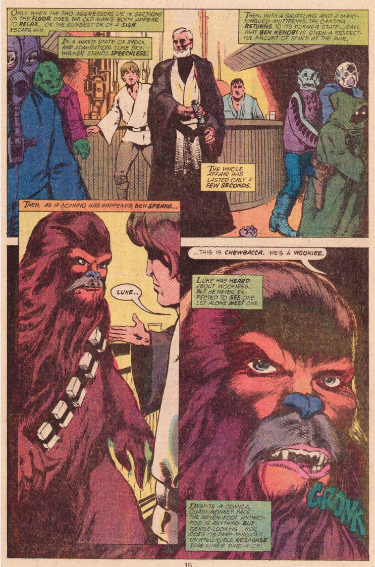
Picking up with the Tusken Raider attack, there is a definite change in the quality of the art. Roy Thomas is still the writer and editor, Howard Chaykin remains the illustrator, but the addition of Steve Leialoha as the embellisher (inker) and colorist changes the entire texture of the issue. Leialoha would go on to have a long career, working at Marvel and DC on various titles.

Gone are Chaykin's sketchy in strokes, and the whole issue has a more photo accurate art style in general. I would assume that they received reference photos from Lucas as the movie came closer to release, but that's assumption. There are also more blues in the color palette, adding a cooling balance to the reds and oranges.


The plot follows along closely with the movie. Ben saves Luke and starts telling him about “The Force.” (Their quotes, not mine). Darth Vader interrogates Leia. Luke & Ben find the wrecked sandcrawler and then Luke's farm is burnt down. They go to Mos Eisley and hire Han Solo and Chewbacca. There is a firefight in the docking bay and they make the jump to lightspeed in the Millennium Falcon.


One point of difference is the deleted scene where Han meets Jabba that was restored in the Special Editions. This was well before Jabba's design was finalized as a giant slug, so here we have a random alien who would later be retconned as Mosep Binneed, Jabba's accountant and occasional face-man.


There's not much to say about the issue. Its a faithful adaptation of that section of the movie and the slight shift in art style is for the better.


Wednesday, April 18, 2018

Legends Never Die: Marvel Star Wars Issue 1


I've spent more time than I really needed to thinking about how to approach the old Marvel Star Wars ongoing from the 70s and 80s. It was one of the original tie-in materials and would end up being a constant thread throughout the Original Trilogy's theatrical run and even outlived it, ending in 1986 with issue 107. That's almost a decade of comics and taken as a whole, its an impressive body of work. Individually, though, it goes in fits and starts, so that's how I figured I wanted to go through the series: Individually, and in fits and starts.

Launching in 1977 right before Star Wars was released (remember, A New Hope was added later), the first issue features scripting and editing by Silver & Bronze Age comics luminary Roy Thomas with art (pencils and inks) by Howard Chaykin early in his career.

The issue covers the beginning of the movie up to the point where Luke is attacked by Sand People in the Jundland Wastes while looking for Artoo.


Like the novelization, the comic script follows an earlier draft of the script than what the final movie would have. There's a lot more Luke on Tatooine stuff, where he witnesses the space battle from the ground and has a farewell meeting with Biggs. Its not something really missing from the movie, but in a medium like comics, the scene adds some good characterization beats for Luke's desire to get off Tatooine.


The art is very 1970s. Vehicles are oddly proportioned and frequently off-model, Chaykin's inks are frequently thick over somewhat sketchy pencils and the colors by Marie Severin are heavy on the reds, oranges and pinks in places. The hyper-stylized color scheme holds together thanks to Chaykin's dynamic poses, but I wouldn't call the art especially great, even for its time. 

Recently, Marvel re-released the six original issues in a “remastered” form with modern coloring techniques and a film-accurate palette, and it just looks like badly proportioned art (It kind of is, but the original coloring helped it stand as a stylistic choice).

The Biggs stuff is nice, the art can be polarizing, but it does feature the best version of Vader choking Admiral Motti, where he casually uses the Force to bring him a cup of coffee while he tortures him.


Thursday, May 11, 2017

Stealing from the Best: Dr. Fate and The Ship of Ishtar


I just finished reading A. Merritt's The Ship of Ishtar, and while there's going to be a review for it soon, I stumbled onto something fascinating about it.

The Ship of Ishtar was first serialized in Argosy starting in 1924. Among the most important facets of the story is Babylonian mythology. Indeed, the main character, John Kenton, is described as being able to read cuneiform as well as English. This is impressive, because cuneiform had only really been reliably deciphered by modern scholars in the 1800s. Roughly less than a hundred years before Ishtar was published. Mesopotamian history and culture was new and fresh in the Western world because scholars were now able to actually study more than architecture, pottery, and what their neighbors said about them.

Kenton's most significant mystical ally is the Mesopotamian god of wisdom and truth, Nabu. In the book, Nabu's color is blue, and Kenton makes good use of a sword blessed by the god once the archaeologist returns to the ship to rescue the red haired priestess of Ishtar, Sharane, from an evil priest of Nergal.


In 1940, DC comics published More Fun Comics #55, in which a blue-clad archaeologist named Kent Nelson, who is a champion of Nabu (revealed in issue 67) equipped with his magical items, rescues an initially red haired woman named Inza (who would eventually become his wife) from an ancient sorcerer. 

That can't be coincidence.

Kent Nelson became Dr. Fate, a prominent 40s super hero, one of the first tights-clad “Super Wizards” (as opposed to mystics like Zatara from 1938 who fought crime in their stage regalia). Fate's crimefighting career expanded greatly from his origins, encountering numerous ancient magical threats, being a founding member of the Justice Society and passing down the Helmet of Nabu first to his wife and then a succession of less memorable pupils. There were even a few times when Nabu himself acted as little more than a cape, gloves, and helmet. The Babylonian heritage of Nabu is eventually lost, instead tying him to ancient Egypt to better synergize with the likes of Hawkman and Black Adam.


Unlike Kenton, who is a two-fisted man of action, all incarnations of Dr. Fate are dedicated magicians who sit among the highest spellcasters of the DC universe. Though Kent Nelson was just as happy to throw some punches around in the 40s as he was to cast spells.

Still, the similarities between the two characters can't be ignored. I don't even think that they're a coincidence, since Dr. Fate's creator, the insanely prolific Gardner Fox (1911-1986) said that he particularly liked Merritt in an early 70s interview. There's your smoking gun. A fan of Merritt couldn't have been ignorant of The Ship of Ishtar. Not with it being Merritt's most popular work.

Fox himself would go on to write for pulp magazines in the 40s and 50s and then novels, though his largest body of work was in comics. Like Merritt, Fox himself would serve as an influence on Dungeons & Dragons, appearing in the Appendix N list of the AD&D Dungeon Master's Guide in 1979.


Does this cheapen Dr. Fate? I don't think so. For starters, Fate's initial design by Howard Sherman is outstanding, and in the visual medium of comics, that matters a great deal. The two characters also diverge considerably, with Fate getting into some truly weird (not necessarily good) adventures in the 80s and 90s. Its derivative in a good way, taking a nugget of an idea (Nabu, god of wisdom selecting a mortal champion) and running with it in a vastly different direction intended for ongoing adventures.


I actually appreciate Dr. Fate a little more now than just as magical powerhouse who makes cool guest appearances, knowing what kind of a literary heritage he has.